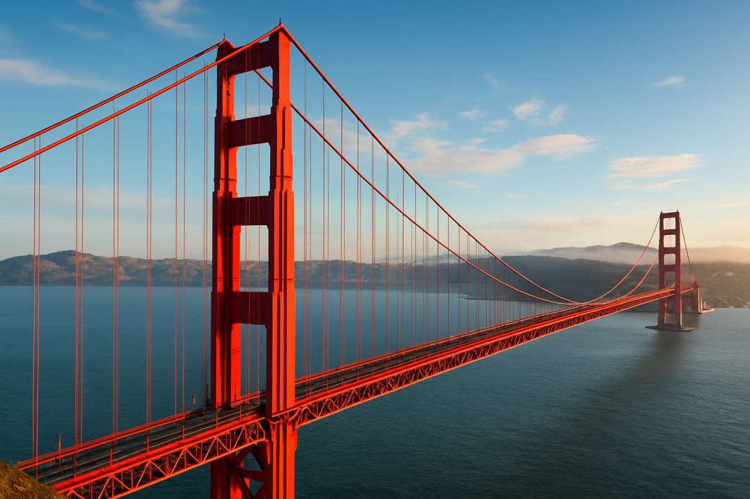
The Golden Gate Bridge is one of the most photographed structures in the world—and its bright orange color, known as International Orange, is instantly recognizable. But few people know why such an unusual color was chosen, who picked it, and how this decision shaped the bridge’s global identity.
The Golden Gate Bridge Wasn’t Supposed to Be Orange
When the Golden Gate Bridge was first proposed, the U.S. Navy insisted that the bridge be painted black and yellow to ensure visibility to ships passing through fog.
Engineers had other ideas—steel gray, black, and even silver aluminum were considered. None of these were meant to be artistic; they were simply functional.
Ironically, the bridge’s now-iconic orange hue was not even in the original plan.
The Accidental Discovery of “International Orange”
When the steel parts of the bridge were delivered from the factory, they arrived coated in a temporary primer paint—a bold reddish-orange color meant only to prevent rust during transport.
Architect Irving Morrow, who later designed the bridge’s Art Deco elements, saw the primer and immediately fell in love with it.
He noticed three things:
-
The color stood out beautifully against the natural landscape
-
It remained highly visible even in fog
-
It complemented the blue of the Pacific Ocean and the sky
Morrow fought passionately for the color, and after multiple debates, his proposal won. The builders officially chose “International Orange” as the final color.
Why Orange? The Functional and Scientific Reasons
1. High Visibility in Fog
San Francisco is one of the foggiest cities in America. Ships navigating the Golden Gate Strait needed a bridge color that stood out clearly.
Orange is scientifically one of the most visible colors in low-light conditions.
2. Weather Resistance
International Orange retains color well even under:
-
moisture
-
saltwater
-
strong sunlight
-
extreme wind
This durability is important for a bridge that faces harsh coastal weather every day.
3. Contrasts Perfectly with Nature
The warm orange complements:
-
the deep blue water
-
the green hills
-
the gray fog
This creates aesthetically stunning views from land, sea, and sky.
The Color That Requires Constant Care
The Golden Gate Bridge is repainted regularly, though not from end-to-end as many think. Instead, small sections are continuously maintained to keep the surface protected from rust.
The paint must be:
-
corrosion-resistant
-
fade-resistant
-
flexible enough for the bridge’s movement
This ongoing work ensures that the signature orange stays bright for generations.
International Orange: More Than Just Paint
International Orange is more than a color—it’s a brand identity.
You can find it in:
-
aerospace design
-
military markings
-
safety equipment
But nowhere does it appear more famously than on the Golden Gate Bridge.
The specific shade used on the bridge is a unique custom blend, slightly different from the official aerospace version.
Symbolism Behind the Orange Color
Over time, the orange color has gained powerful symbolic meaning:
-
Innovation – a bold design choice in 1937
-
Modern engineering – showcasing human creativity
-
Warm welcome – the color gives a friendly, uplifting appearance
-
San Francisco identity – the bridge defines the city’s look
The color has become so iconic that any other shade would feel unthinkable.
Did They Ever Consider Repainting It a Different Color?
Yes. In the 1950s and again in the 1980s, agencies suggested:
-
bright neon colors
-
safety yellow
-
pure red
-
standard metallic colors
Each time, public support helped keep the original orange intact. San Franciscans deeply associate this color with the city’s personality.
Fun Facts About the Golden Gate’s Color
-
The bridge is 746 feet tall, making it highly visible from air and sea.
-
The paint weighs thousands of gallons every year for maintenance.
-
Hollywood films digitally enhance the orange for extra vibrance.
-
The bridge is repainted so often that workers joke it’s “never finished.”
Why International Orange Still Matters Today
In an era of modern architecture, the Golden Gate Bridge’s color continues to inspire:
-
graphic designers
-
photographers
-
architects
-
urban planners
Its bold color remains a lesson in how design and engineering can work beautifully together.
Final Thoughts
The Golden Gate Bridge is orange not by accident—but by vision, science, and artistic genius. Its color does more than decorate steel; it enhances safety, complements nature, and symbolizes the heart of San Francisco.
Today, International Orange is as iconic as the bridge itself—an unforgettable hue that captures the imagination of millions.


